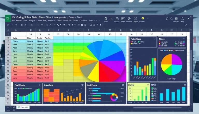
Excel How to Build a Pivot Table: Simplifying Data Analysis
Welcome to our excel pivot table tutorial! We will show you how pivot tables in Excel can change your data analysis. They help you find important insights from big datasets easily. Pivot tables are used in business, finance, and marketing to make data easier to understand.
Using pivot tables in Excel saves a lot of time. They let you look at data in many ways. Whether you’re checking sales, finances, marketing, or inventory, pivot tables help you make smart choices. We’ll teach you everything from the basics to how to use them well.
Understanding the Basics of Pivot Tables
A pivot table is a powerful tool in Excel. It helps you quickly sort and summarize big datasets. It turns raw data into a clear format, making trends and insights easy to see.
Knowing what a pivot table is and how it works is key. It’s essential for anyone wanting to get better at data analysis. By learning pivot table basics in Excel, you can make data processing easier.
What is a Pivot Table?
A pivot table is an analytical tool. It lets users summarize big amounts of data well. It helps group and rearrange data, making it easier to find trends and sums.
This tool supports many ways to look at data. It’s very useful for managing big datasets.
Key Benefits of Using Pivot Tables
Pivot tables offer more than just simplicity. They let you analyze and report data in many ways. You can sum up sales of different products or show performance metrics.
They automatically make subtotals and grand totals. This makes it easy to do custom calculations. Plus, they stay useful as your data changes.
Common Use Cases for Pivot Tables
Pivot tables are very versatile. You can use them to compare sales, count employees by department, or check marketing campaign results. Excel even suggests the best layout for your data.
These examples show how important pivot tables are in business and finance. They help make decisions clearer by presenting data well.
Preparing Your Data for Analysis
Getting your data ready is key to good analysis. We need to organize our spreadsheet well. This makes our pivot table more insightful.
Organizing Your Spreadsheet
First, make sure your data is in a table. Each column should have a clear header. Don’t have empty rows or columns.
Power Query can help make your data better with just a click. It’s great for fixing bad data.
Ensuring Data Quality
Good data quality is crucial for accurate insights. Check for duplicates and mistakes. Clean data helps make better decisions.
Important Data Types to Consider
Knowing about data types in excel is important. There are numbers, text, and dates. Each type affects how we see the data.
For example, numbers can be added or averaged. Text needs to be sorted. Correct types help your pivot table show the right info.
| Data Type | Description | Example |
|---|---|---|
| Numerical | Data that represents numbers, suitable for calculations. | Sales Figures |
| Text | Data that consists of alphanumeric characters, used for categorization. | Product Names |
| Date | Data representing dates, useful for time-based analysis. | Order Date |
Creating a Pivot Table Step-by-Step
Creating pivot tables in Excel might seem hard at first. But, with a clear plan, it’s easier. We’ll show you how to pick data and choose a good pivot table layout for your analysis.
Accessing the Pivot Table Feature
First, go to the ‘Insert’ tab in Excel. Highlight the data you want to analyze. Then, click on ‘Pivot Table.’ This opens a dialog box.
Here, you can choose where to put your pivot table. Pick a new worksheet or an existing one. This keeps your data organized and easy to find.
Selecting Data for Your Pivot Table
Then, pick the right data for your pivot table. Look for fields that match your goals. Make sure your data is clean and has column headers.
With good data, making pivot tables in Excel is easier. This makes summarizing your data simple.
Choosing the Right Pivot Table Layout
After picking your data, choose the right pivot table layout. The layout shows how your data is organized. Think about what you want to show in your analysis.
A two-dimensional layout is good for seeing comparisons and trends. Adjusting the layout to fit your needs helps you understand your data better.

Customizing Your Pivot Table
Customizing pivot tables in Excel lets us dive deep into our data. We use pivot table filters and formatting to make it clear and pretty. With 85 styles, making your pivot table look good is easy.
We can add gridlines to make it easier to read. This helps our data tell its story well.
Adding Filters and Slicers
Using pivot table filters and slicers helps us see what we need. We can pick what we want to see. This makes our data easier to understand.
It helps us find important info in big datasets.
Modifying Data Fields
Changing data fields is key to customizing pivot tables. We can use Sum, Count, and Average to get more info. It’s smart to replace blanks with zeros.
This makes our reports clear and complete.
Formatting Options for Enhanced Visibility
Good formatting is key for clear data. We can use different formats and styles to show values well. Conditional formatting makes reports look good and tell a story.
For more tips, check out this article on formatting options. These tips help make our pivot tables better.

Analyzing Data with Pivot Tables
After making your pivot table, it’s key to understand the results. This helps you make smart choices. By using pivot tables well, big data becomes useful information.
Interpreting Your Pivot Table Results
Looking at your pivot table results helps see trends and differences. You can check sales by area or how employees are doing. Pivot tables let you change how you see the data easily.
You can look at data by month, who sold it, or other things. This helps a lot with money analysis and reports.
Exploring Advanced Calculations
Advanced calculations in pivot tables go deeper. You can make special fields like profit margins right in the table. This means you don’t need extra formulas.
This makes data analysis smoother and faster. It’s a big help in getting your work done quicker.
Generating Charts from Pivot Table Data
Turning pivot table data into charts makes it easier to share. These charts show trends and important points clearly. They help turn numbers into stories that help us make better choices.
Troubleshooting Common Issues
Pivot tables are great for analyzing data, but sometimes they don’t work right. We might see blank rows or columns that mess up our data. To fix this, use the ‘For Empty Cells Show’ option. It keeps our tables looking neat and helps us understand our data better.
Dealing with Blank Rows or Columns
Calculation errors can also happen. They might come from wrong data types or formatting. For example, you might see “Unable to load the Data Model” if heading names change.
Also, a “Field Name is Not Valid” error can pop up if some cells are blank. This stops us from making a PivotTable. It’s important to make sure our data is correct and organized.
Resolving Calculation Errors
Always refresh your pivot table when the data changes. Not doing this can give you old results. Sometimes, small differences in data can cause problems.
Using functions like ROUND can help fix these issues. Keeping our data clean is key to reliable analysis in pivot tables.


